
Project Maestro is a new data preparation application that Tableau has delivered. Tableau's users are people who have questions to data, are curious to learn and improve their everyday work and life with the insights from their data. In the same way, Project Maestro strives to help those people to prepare their data so that they can bring it into Tableau for visual analysis.
The UX has to be simple, visual, and direct. That is, it should allow users to explore their data and see the result of their actions right where it happened. Users with no technical background should be able to clean their data, yet powerful to perform complex task when needed.
I was a UX member of the team, building high level product flow and key data prep features.
Role
- Facilitate scope discussion through visualization of the user flow
- Iterate designs via whiteboard and visual concepts
- Prototyping for usability studies
- Detailed design for final delivery of features
- Work with developers on detailed feature decision
Tools
- Sketch for visuals (concepts, flow, design)
- InVision for design review
- Axure to build prototypes
- Tableau for use case analysis
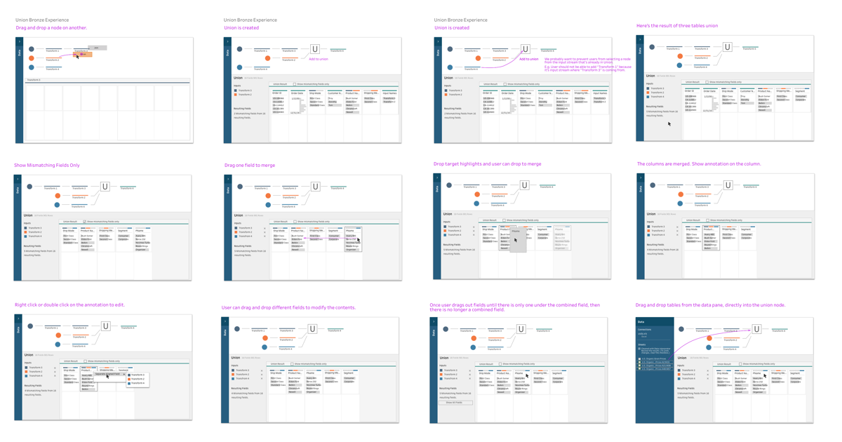
Feature: UNION tables in Data Prep
Let's say you maintain household income and spending in a spreadsheet. Each sheet in the file contains income and spending each month. You want to analyze the annual average spending or monthly spending trend, then you will want to merge the sheet into the single large table so that you can dice and slice the data for your purpose. This operation of merge is called "UNION" in the database world.
It becomes sometimes tedious task, when you have the column header in different names, e.g. in one sheet, a column name is cost, and then later, price, both intending to be the same thing. You, the human, would have to tell the machine that they are the same thing, so that they can be merged into the single column. When you have a lot of data with a lot of columns, it can easily become overwhelming.
Challenge
When we first started out working on UNION feature, there were many user tasks that we assumed users need to do. That resulted in highly complex UI that was very difficult to follow. I came in at that stage, and worked with the team to distill the problem space into the most important one. That is;
Users need to align fields that have the same meaning but different names between tables when they merge.
Process
After drilling down into the single most important user task, we went through design iterations to decide scope and UX flow. Along the way, we kept on asking this question to test the design against the product principles.
How can we offer this feature so that users perform their task right where it happens?
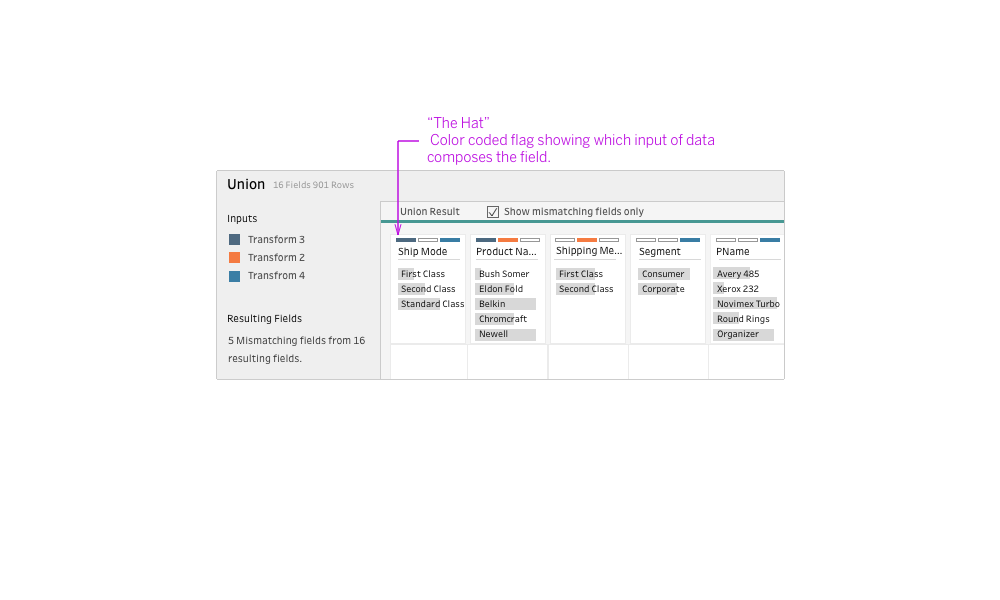
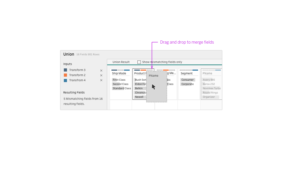
To help users to achieve the main task of matching fields, users first need to see which fields have missing inputs. We started out with the color-coded inputs to represent the input. Through iteration, we put the color coded input to the top of the field so that users can understand what's going on right where it happens. We started calling it "The Hat", as it showed up like a hat above each field. After reviewing the mismatched fields, users can drag and drop the fields to merge them together and fix the result of the UNION.
Result: Experience that is visual and direct
With the union feature, users can easily see which fields should match and combine them intuitively. Some of the ideas were carried out into other features.
